Client
TradeWorks
Case Study · UX/UI · Platform Design & Development
A job platform built from the ground up for the blue-collar workforce.
Client
TradeWorks
Scope
UX/UI · Design & Build
Crew
Link Salas × PowrIps
Launch
Soft Launch · Spring 2025
Every great job board is built around a résumé. Most trade careers aren't.
While designing the award-winning Franklin Report, I kept hearing the same problem from both sides of the table: architects and interior designers couldn't find skilled trade workers, and the workers who could do the job had no streamlined way to be found. General-purpose job boards are built around résumés, keywords, and office careers — not licenses, job sites, and hard-earned reputations.
TradeWorks began as my answer to that gap: a platform designed around how trade professionals actually present their work. I designed and built it from the first wireframe to the shipped product — every color, frame, and image — working alongside the development team at PowrIps.
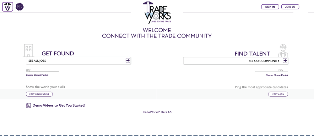
A job platform serves two audiences with opposite goals, and most bury that fork three clicks deep. I put it on the very first screen: the home page splits into two clear paths — one for job seekers, one for employers — so nobody has to decode navigation before they can act.
For an audience that doesn't live inside job-board conventions, the first click had to feel obvious, not learned.
Build a profile around your trade, your work, and the job you actually want.
Find skilled trade professionals by craft and location — not keyword luck.
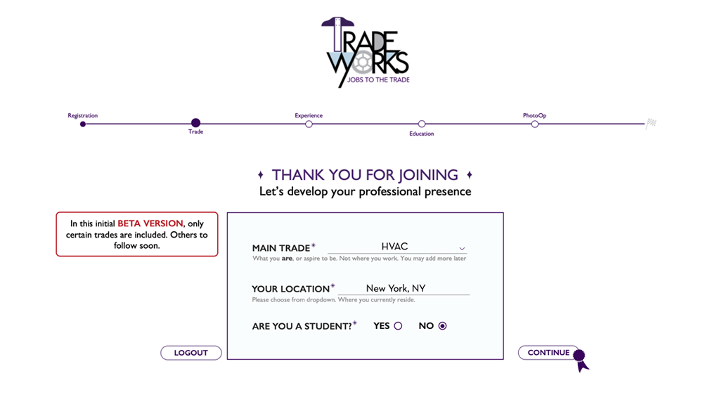
Forms are where sign-ups go to die, so onboarding opens with just two questions: your trade and your location. That alone is enough to start matching people with relevant opportunities — value before effort.
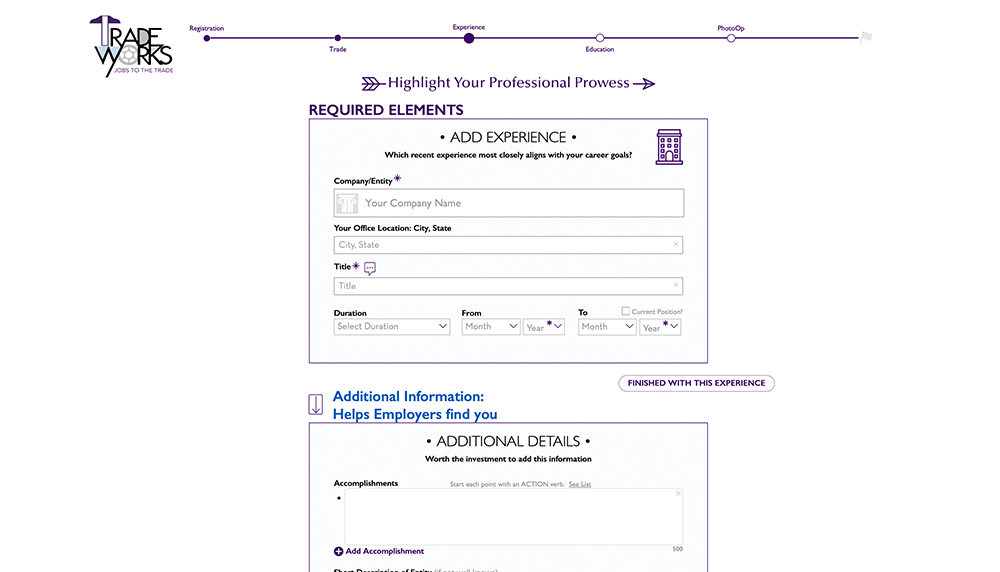
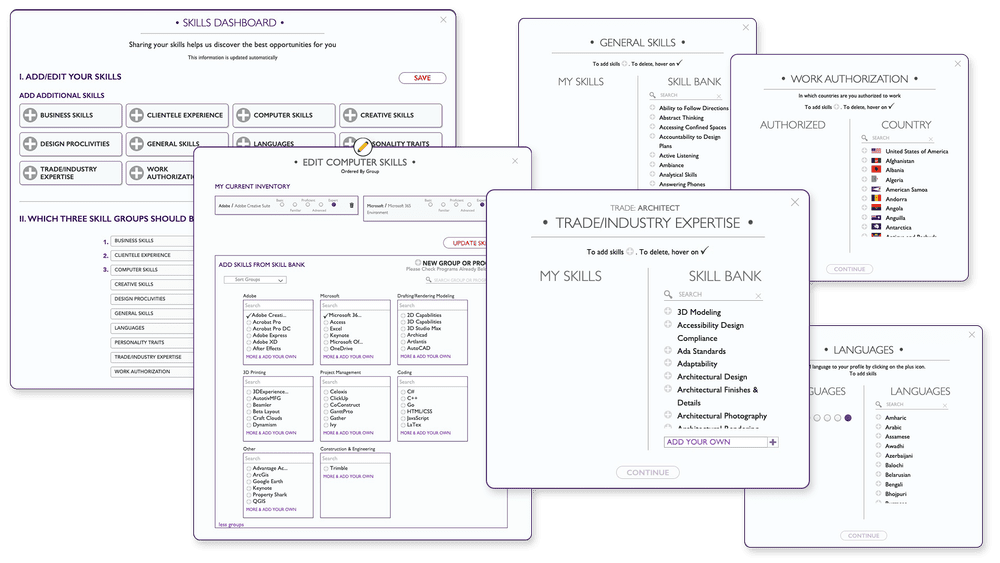
From there, the flow guides users through their story one screen at a time: work history, education, and experience, then a headshot and background image that turn a database record into a person. Every step has a single job, and nothing asks for more than it needs.
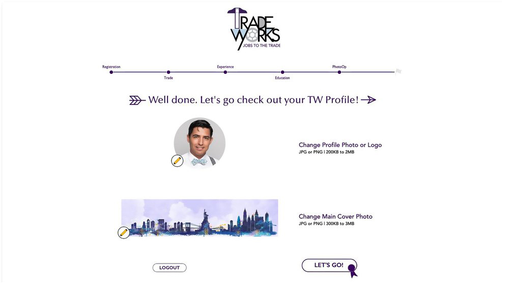
The finished profile is clean, personal, and easy to keep current. Simple editing tools let users add extra skills, accolades, and personal details — even a video resume, because for hands-on work, hearing someone talk about their craft says more than any bullet point.
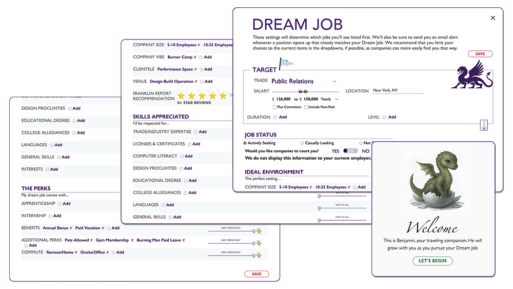
The piece I'm proudest of is the Dream Job section: a dedicated space where job seekers define exactly what they're looking for — a certain role, location, or work environment. It flips the usual dynamic. Instead of only reacting to listings, workers state their terms, and employers can search for genuine fit.
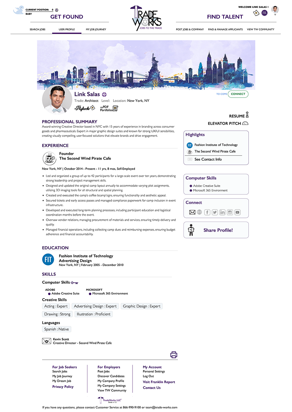
Job sekers display their carreer achivements right on top
A face and a voice attached to the work — trust before the first phone call.
Structured, searchable panels instead of a wall of résumé text.
Workers state their ideal job, helping the system to narrow the best options.
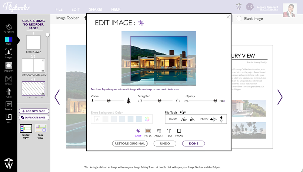
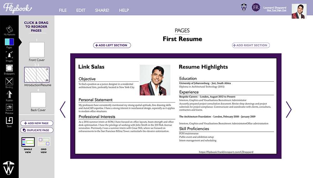
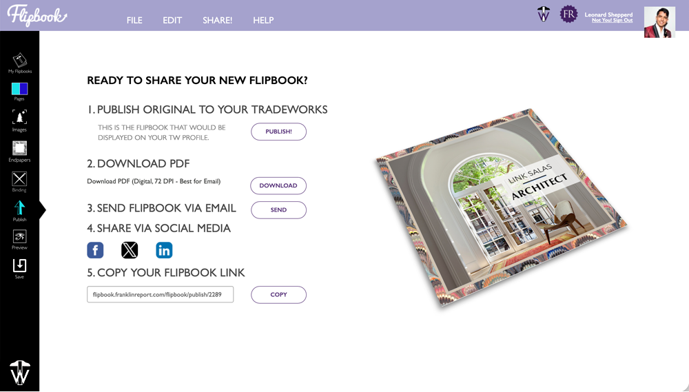
Trade professionals win work with leave-behinds, so we built a tool for making them. Code-named Flipbook, it lets users assemble a polished portfolio in minutes and publish it three ways: as a PDF, as an animated online flipbook, or as a print-ready file formatted for commercial print shops.
One layout, three outputs — designed once, deployed anywhere.
v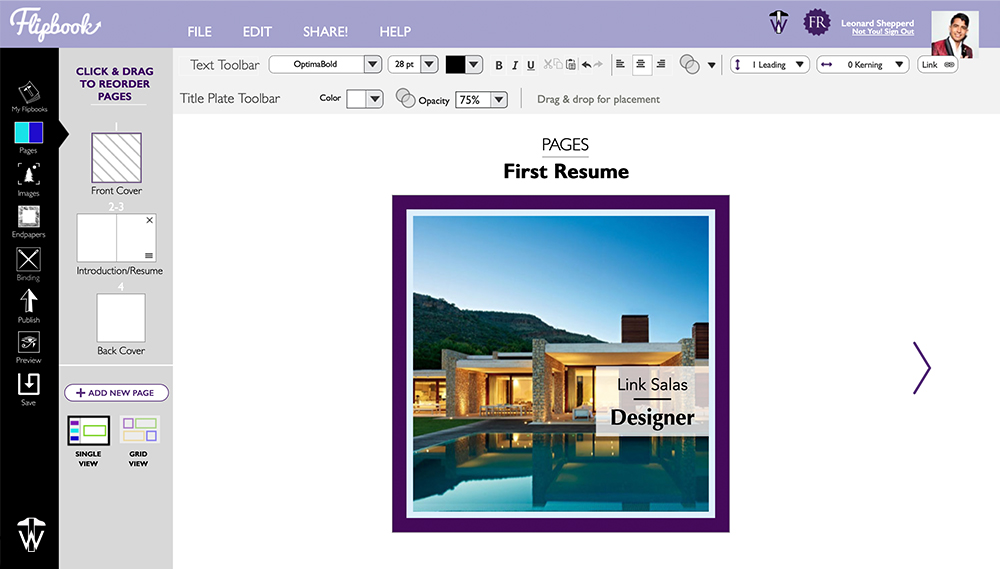
Status
Soft-launched
late spring 2025
Built With
PowrIps
design + development
See It Live